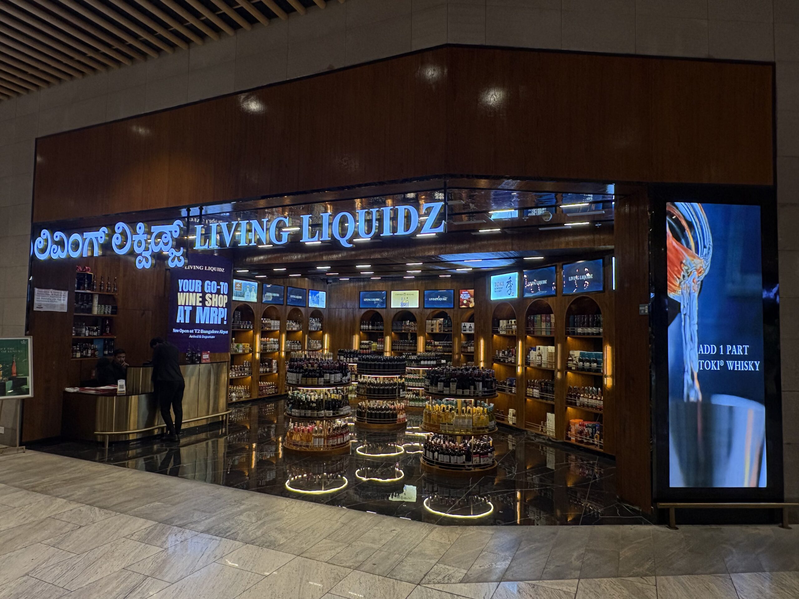
There is a certain kind of retail space that stops you mid-stride. Not because it is loud. Not because it is overdesigned. But because it feels right, like the brand and the building are saying the same thing at the same time. The Living Liquidz build in Bangalore is one of those spaces. And there is a lot to learn from how it was put together.
What most retail interiors get wrong
Walk into most liquor retail stores in India and the experience is transactional at best. The shelves are full. The lighting is functional. The layout tells you where to pay. And that is about it.
There is nothing wrong with transactional retail. But for a brand like Living Liquidz, which positions itself as a premium, experience-first destination for spirits and beverages, transactional just does not cut it. The customer walking in is not picking up a bottle on the way home. They are making a considered choice, often browsing, often discovering. The space has to support that behaviour.
This is where the design brief gets genuinely interesting.
The real challenge: two things that usually fight each other
Functionality and brand experience are not natural allies in retail design. Functionality says: maximise product display, keep customer flow logical, make restocking easy. Brand experience says: create emotion, slow the customer down, make them feel something.
Most interiors solve this by choosing one. Either the space is a very good warehouse, or it is a very good showroom that is a pain to operate. Getting both right at the same time requires deliberate thinking at every stage, from the floor plan to the fixture height to how light falls on product at 7 pm.
How does the Bangalore space thread the needle?
The Living Liquidz build in Bangalore works because it treats design and operations as one problem, not two separate departments handing off to each other.
That kind of integration begins with smart space planning, where every layout decision is made to support both functionality and the overall user experience. A similar approach is explored in How Smart Space Planning Enhanced the Arnika Design & Build Project, which highlights how thoughtful planning creates efficient, adaptable, and visually cohesive commercial spaces.
A few things stand out when you look at how the space is put together:
- Zoning that serves the customer journey, not just the inventory count: Different spirits categories are not just grouped for the staff’s convenience. They are sequenced to mirror how a customer actually browses, from familiar to discovery, from affordable to premium.
- Fixtures that do double duty: The display elements are built to show product beautifully, but they are also designed so that restocking does not mean dismantling a visual set-up each time. This sounds like a small thing. In a high-footfall store, it is the difference between a team that is always firefighting and one that can actually focus on the customer.
- Lighting with intent: Premium spirit packaging is designed to be seen in a certain way. The lighting in the Bangalore store is not uniform. It is directional, warmer in some zones, cooler in others, which pulls the eye toward specific product tiers without screaming “look here.”
- Material choices that signal quality without over-engineering: The finishes read premium, but they are also practical. Surfaces that show every fingerprint and get scuffed within six months are a design mistake, regardless of how good they look on launch day.
Why brand experience cannot be an afterthought?
Here is the thing about retail design that does not get said enough: the brand experience is not the visual identity applied to a space. It is the sum of every small decision the customer does not consciously notice but absolutely feels.
The Living Liquidz build in Bangalore gets this. The space does not try to tell you it is premium through signage and logos alone. It makes you feel it through proportions, through how much room you have to browse without bumping into another person, through the way the counter is positioned so you feel attended to rather than processed.
That last point matters more than most brands realise. Counter placement in a premium retail environment is not a logistics call. It is a hospitality call.
The shelf is a stage
There is a useful way to think about product display in a space like this: every shelf is a small stage, and every product on it is a performer. A well-designed fixture gives the product room to be seen. A badly designed one crowds it, flattens it, and makes everything look the same price regardless of what it actually costs.
In a category like premium beverages, where a significant portion of purchase decisions happen in-store, the fixture is doing active selling work. Getting this right is not decoration. It is revenue.
What does Bangalore specifically demand?
Every city in India has a slightly different retail temperament. Bangalore’s customer, particularly in the premium beverage segment, tends to be informed, value-driven in the real sense (not just price-sensitive), and accustomed to good design from their professional environments. Tech campuses, co-working spaces, airport lounges. These people know what a well-considered space feels like.
So a store that feels generic, even if it is well-stocked, reads as a mismatch. The Living Liquidz build in Bangalore is calibrated for this audience. The design speaks to someone who notices things.
That said, it does not alienate the casual shopper either. This balance, feeling premium without feeling exclusive, is genuinely hard to achieve, and it comes down to scale, approachability of layout, and how welcoming the entry experience feels. Get any one of those wrong and the whole effect slips.
The operational reality behind the aesthetic
Let us talk about something that often gets edited out of design case studies: what happens after the opening week.
A store that looks spectacular on day one but is impossible to maintain, restock, or adapt as the product range changes is not good design. It is an expensive photography set.
The Living Liquidz build in Bangalore was planned with the operational reality of a working retail store in mind. Fixture modularity, durable surface choices, lighting that does not require specialist maintenance, these decisions do not show up in the photographs, but they are the reason the store still looks like itself six months in rather than a slightly worn-out version of the original idea.
Good retail design has a long tail. The work that goes into making a space last, structurally, visually, operationally, is as important as the work that makes it look good on launch day.
Conclusion
India’s premium retail category has matured considerably over the last several years. The customer has changed, the brand ambitions have changed, and the expectation from the physical space has changed right along with them.
The days when a premium-looking facade was enough are behind us. Today, the interior has to do real work, commercial work, brand work, operational work, all at once.
The Living Liquidz Bangalore project is a decent example of what that looks like when it comes together well. Not because it is the loudest space or the most photographed one. But because it actually works, for the customer browsing on a Tuesday evening and for the staff running the store on a Sunday rush.
That is the quiet standard worth shooting for.
Atmosphere.work is a design-and-build company that delivers retail, workspace, and hospitality interiors, from concept through manufacturing and final fit-out. If you are thinking about a new store or a significant retail refit, the team handles the full scope under one roof.