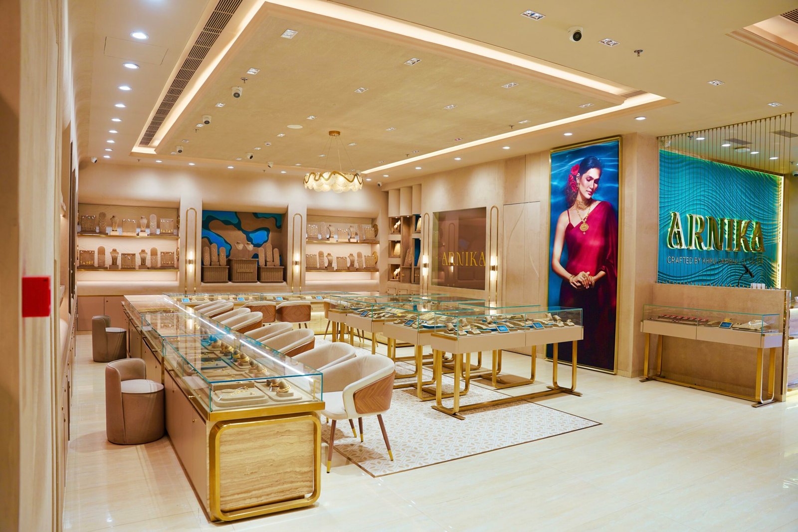
Space planning is not about fitting more into less. It is about making less feel like more, without anyone in the room noticing the effort behind it. The Arnika by Khimji Dayabhai Group Design & Build is a project that earns attention precisely because of this. Every square foot of it is doing deliberate work.
The problem with space that is not planned
Most commercial interiors start with a floor plan and end with furniture. The brief goes something like: here is the area, here is the budget, make it look good. And the result, more often than not, is a space that looks acceptable in photographs and feels slightly off in person.
You cannot always explain why. The proportions feel wrong. You are not sure where to stand. The room is full of things but somehow still feels unresolved.
That feeling has a source. It is what happens when space planning is treated as a layout exercise rather than a thinking exercise. Where things go matters. Why they go there matters more.
Scale and proportion are doing more than you think
There is a reason certain rooms feel immediate and generous the moment you step in, even when they are not especially large. Scale is calibrated. The ceiling height relates to the floor area in a way that does not feel accidental. Furniture sits at proportions that make the room feel organised without feeling controlled.
The Arnika by Khimji Dayabhai Group design & build gets this right. The spatial decisions here are not cosmetic. They are structural in the true sense; they shape how the space is experienced before a single finish or fitting is even registered.
What smart space planning actually looks like in practice
Let us get specific. Smart space planning in a design-and-build context is not a single decision, it is a sequence of connected ones, each of which constrains and informs what comes next.
In a project like Arnika, that sequence looks something like this:
- Understanding how the space will be used across different times of day: A room that works well at 11 am under natural light and works badly at 7 pm under artificial light is only half-solved. Good planning accounts for both.
- Separating primary zones from secondary ones without hardcoding the boundary: Rigid zoning ages badly. The most durable layouts allow for reconfiguration without requiring a full refit.
- Working with the building’s natural constraints rather than against them: Column grids, structural walls, window placements, these are not obstacles. They are the grammar of the space. Good planning reads them correctly and builds from them.
- Thinking about movement before thinking about furniture: How people enter, how they move through, where they naturally pause, these are the questions that shape the floor plan. Furniture fills the plan. It does not create it.
The ceiling is part of the plan too
This one gets missed more than it should. Space planning that only considers the horizontal, the floor, the furniture, the partitions, is incomplete. The vertical dimension, and especially the ceiling, carries a significant portion of the spatial experience.
In the Arnika by Khimji Dayabhai Group design & build, the treatment of ceiling heights across different zones is deliberate. Lower zones feel more private, more contained. Higher ones read as social, transitional, generous. This is not an accidental variation. It is a planned contrast doing specific emotional work.
Why did the Khimji Dayabhai Group brief required this level of thinking?
Not every project demands the same degree of spatial rigour. A quick fit-out of a standard footprint with a known brief is a different kind of problem from a design-and-build engagement where the spatial identity of the project is itself part of the deliverable.
Arnika sits in the second category. This is a project where how the space feels is not separate from what the space does, the two are the same brief.
That raises the stakes for space planning considerably. Get it right, and the design reads as cohesive, considered, and confident. Get it wrong, and no amount of good material or lighting salvages the experience. The bones have to be right before anything else goes on top of them.
This is also why design-and-build as an integrated model matters for a project like this. When design and construction are handled by the same team, spatial decisions made during planning do not get lost or compromised during execution. The thinking that went into the floor plan survives to the finished room. That is not always guaranteed when design and build are handed off between different teams.
The same integrated approach is equally important in customer-facing commercial spaces, where every layout decision must support both operational efficiency and the overall brand experience. This balance is explored in How the Living Liquidz Bangalore Interior Balances Functionality and Brand Experience, where thoughtful interior planning enhances both business performance and customer engagement.
Three spatial decisions that shaped the Arnika outcome
Without going into proprietary detail, there are three categories of spatial decision that tend to define outcomes in projects of this type.
1. Entry sequencing
How you arrive in a space sets every expectation that follows. A cramped, under-lit entry undercuts everything that comes after it, regardless of what that space looks like. A well-considered entry, even a modest one, builds anticipation correctly. In the Arnika by Khimji Dayabhai Group design & build, the arrival experience is not left to chance.
2. Transition zones
The space between zones is where poorly planned interiors show their seams. A corridor that is too narrow, a threshold that is ambiguous, a shift in floor finish that signals nothing, these are the small failures that accumulate into a large sense of discomfort. Good transition planning makes these moments feel inevitable, not improvised.
3. Anchor points
Every well-planned space has moments that stop you. Not because they are loud or visually heavy, but because they have been placed to create orientation. You know where you are relative to them. In a commercial or hospitality interior, these anchor points are not decorative decisions. They are navigational ones.
Conclusion
There is a temptation in design conversations to jump to finishes, materials, colours and lighting before the spatial structure is settled. Understandable. Those elements are more immediately legible. You can point to them, photograph them, show them in a mood board.
Space planning does not photograph well. It is felt, not seen. And this is precisely why it gets undervalued until the space opens and people start using it, at which point the gaps in the planning become very obvious very quickly.
The Arnika project demonstrates what is possible when spatial thinking comes first and everything else is organised in relation to it. The result is a space that holds up under use, not just under a camera.
That is a harder thing to achieve than it looks. And it is usually the thing that makes the difference between a project that gets talked about long after it opens and one that quietly recedes from memory by the following year.
Good space planning is quiet. It does not announce itself. But remove it from any well-regarded interior and the whole thing unravels.
Atmosphere works as a design-and-build partner for retail, workspace, and hospitality projects, handling design, manufacturing, and execution under one team. If your next project needs spatial thinking built in from the start, that is exactly the kind of brief we work best with.